Module 1.5
The Grammar of Graphics
- Have a look at the documentation for ggplot2
- Familiarize yourself with the
ggplot2cheatseet - Generate a QMD file in your modules project folder so that you can code along with me and do the exercises.
If you have installed the Tidyverse, then you should already have the packages for this model, including ggplot2. You can go ahead and load ggplot2 along with readr and dplyr.
Overview
In the last module we learned about the Tidyverse. This week we are going to delve into the key package used to visualize data in the context of the Tidyverse–ggplot2. We will learn how to make bar charts (also known as column charts), histograms, line charts and scatter plots. Along the way we are going to be talking about the “grammar of graphics” that ggplot2 is based on.
The Grammar of Graphics
The “gg” in ggplot stands for “grammar of graphics”, which is a layered approach to constructing graphs based on a book by Leland Wilkinson.
The grammar of graphics is a framework for thinking about how to construct visualizations in a consistent and coherent way. The basic idea behind it is that data visualization has a language with its own grammar, and that the elements of this grammar can be combined in a systematic way to create a wide variety of visualizations.
The basic components of a ggplot2 visualization are the data that you want to visualize, the aesthetics (or dimensions) of the visualization, the geometric objects (or geoms) that you want to use to represent the data, and various other elements like color scales, themes, and annotations. As you will see, each of these elments is “added” onto the plot in a systematic way quite literally using the + sign.
Which Visualization Do I Use?
Choosing the right visualization depends on the type of question you’re asking and the structure of your data. If you’re looking at trends over time, such as stock prices, a line chart is typically most effective. To show the distribution of a variable, like income within a country, use a histogram, density plot, or boxplot. When comparing values across categories—such as female labor force participation across MENA countries—a bar chart works well. Finally, to explore relationships between two variables, like poverty and inequality across countries, a scatterplot is the appropriate choice.
Bar charts
Let’s get started with our first visualization–a basic bar chart. Our aim here is going to be to summarize levels of democracy across different regions like we did in the last lesson, but this time we will illustrate the differences with a chart.
We will start by loading in the dem_summary.csv file that we made in the last lesson. You should already have it stored in your data subfolder for this module. But just in case here it is again:
Next we will use these data for our first ggplot() call. The ggplot() function takes two arguments: data and mapping. data refers to the data frame that includes the variables we want to visualize and mapping refers to the aesthetics mappings for the visualization. The aesthetics mappings are themselves presented in a quoting function aes() that defines the x and y values of the plot along with other aesthetic values like fill, color and linetype. We will focus on x and y values here and return to these additional aesthetic values later.
After our ggplot() call, we can add a series of additional functions to define our visualization following a + sign. The most important group are the geoms which will define the basic type of plot we want to make. In this case, we are calling geom_col() for our histogram and specifying that the fill color should be “steelblue.”
From there we will further customize our visualization with the labs() function to provide a title, axis labels and a caption.
dem_summary <- read_csv("data/dem_summary.csv")

ggplot(dem_summary, aes(x = region, y = polyarchy)) + # ggplot call
  geom_col(fill = "steelblue") + # we use geom_col() for a a bar chart
  labs(
    x = "Region",
    y = "Avg. Polyarchy Score",
    title = "Democracy by region, 1990 - present",
    caption = "Source: V-Dem Institute"
    )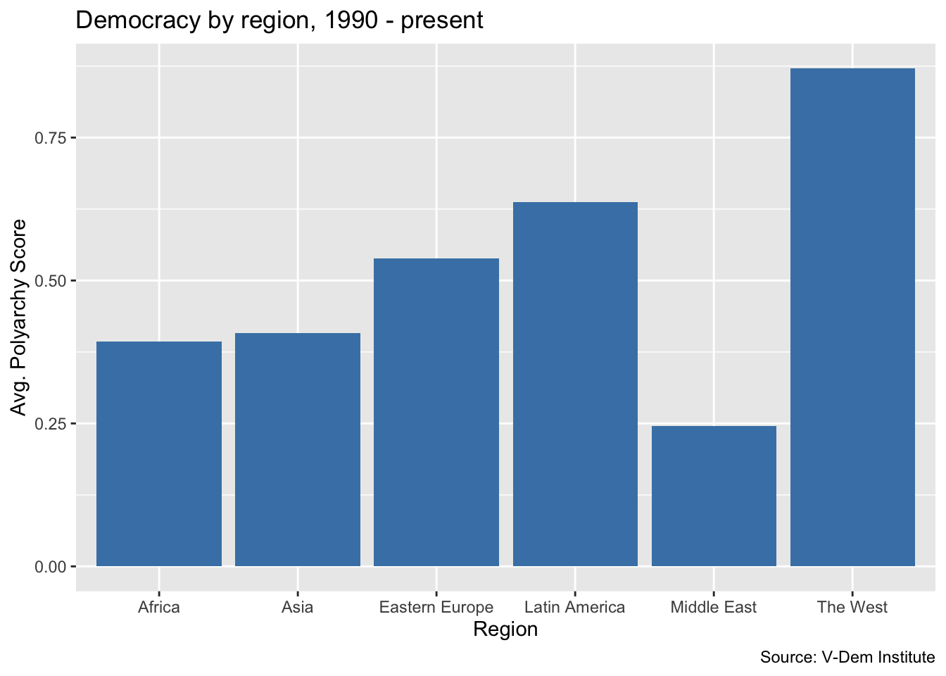
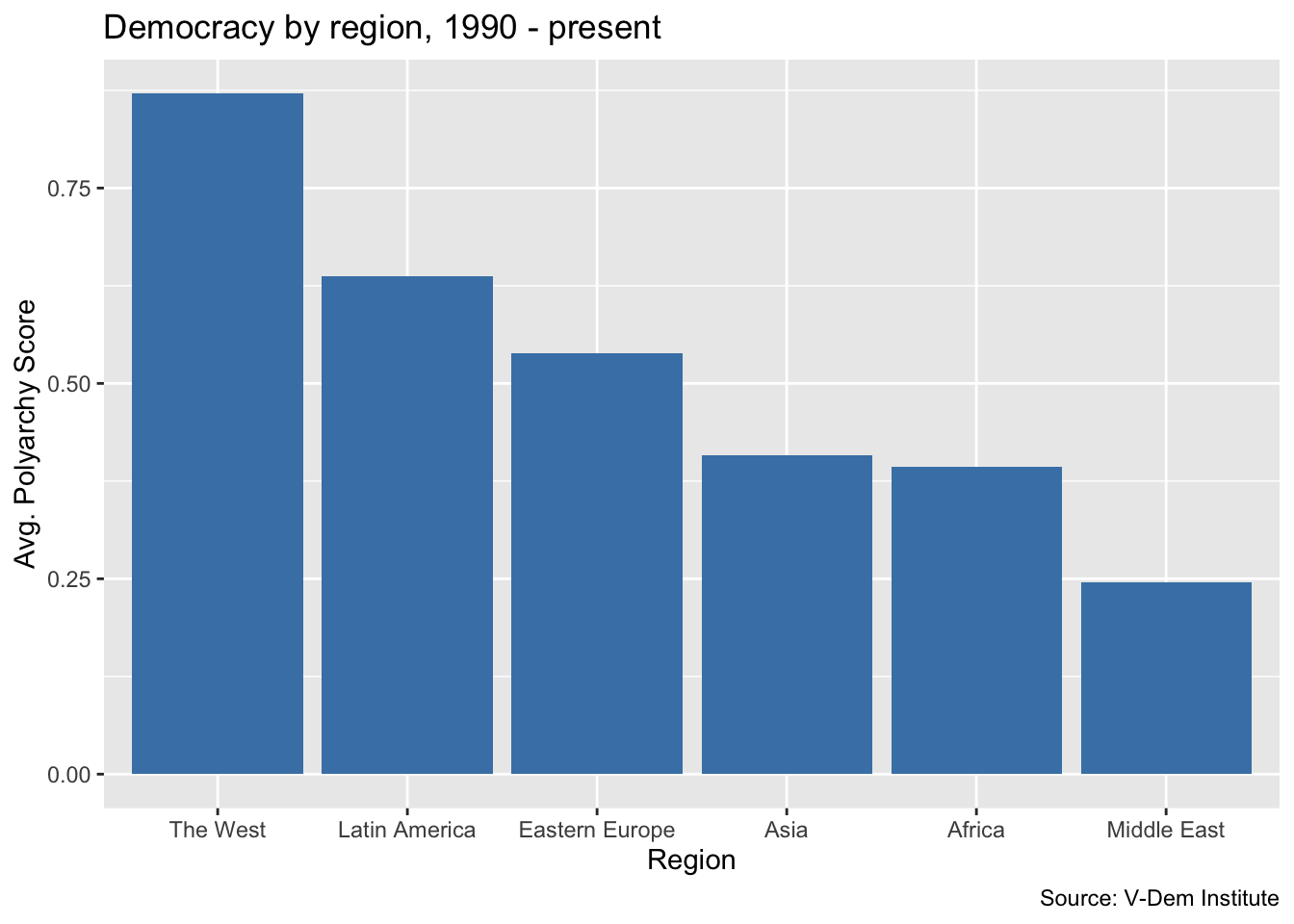
This looks like a pretty good columnn chart, but frequently we would want the bars of our bar chart to be sorted in order of the values being displayed. Let’s go ahead and add the reorder() function to our aes() call so that we are reordering the bars based on descending values of the average polyarchy score.
Histograms
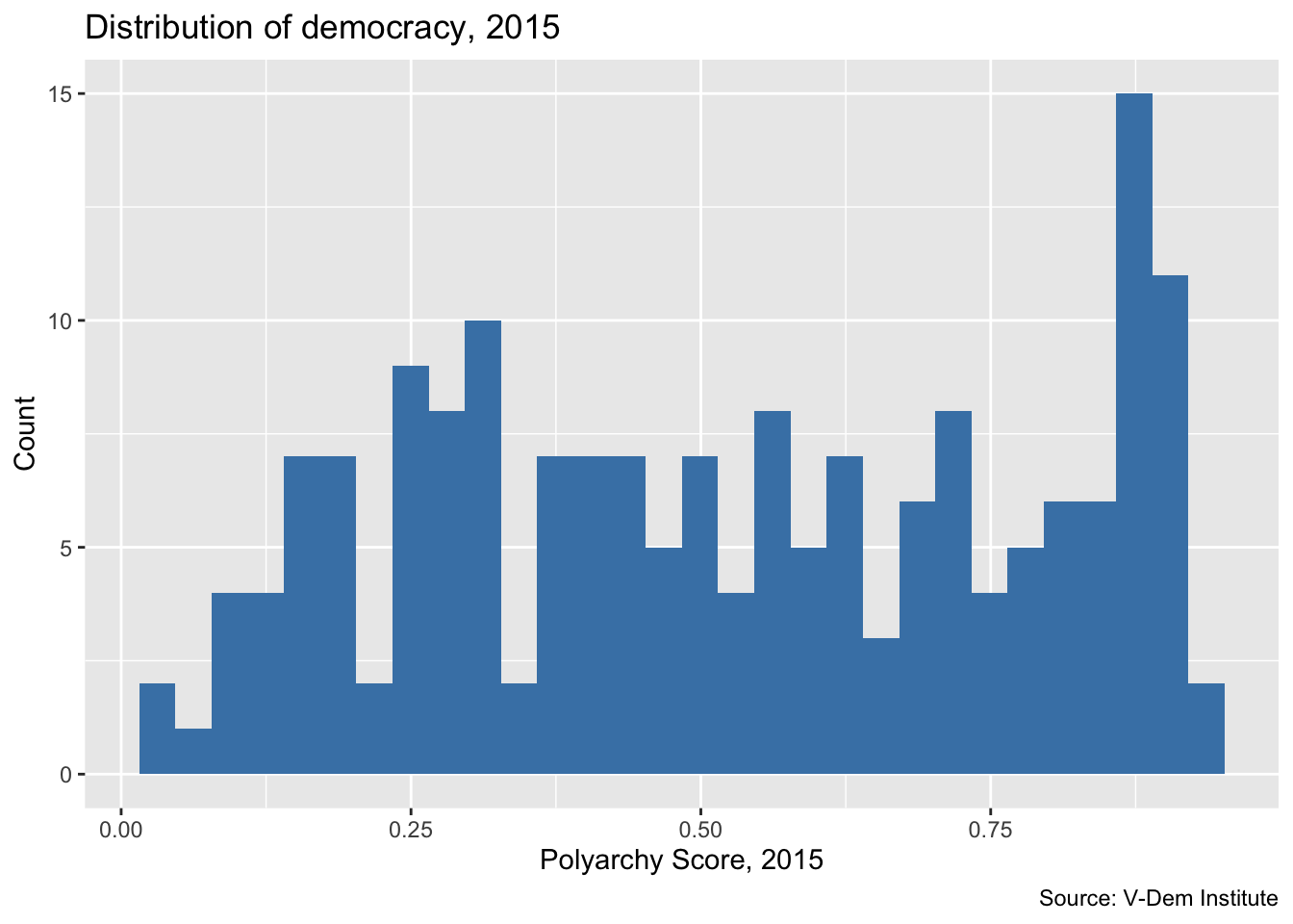
Now let’s do another ggplot() call to make a histogram. We’ll start by reading in the dem_women.csv file from our previous lesson. Again, these should already be stored in the data subfolder for this module, but just in case:
For these data, we are going to have select one year to visualize because they feature a time series. We will use the filter() function from dplyr to select the year 2015. We use the pipe operator (|>) to pass the data frame to the filter() function. We are going to cover the filter() verb and the pipe operator in more detail in the next module, but for now just know that filter() selects a column and the pipe operator allows us to pass the data frame to the next function without having to re-specify it.
From there, we call ggplot(), specifying the polyarchy score on x-axis. But this time we change the geom to geom_histogram(). We also change the title and axis labels to reflect the fact that we are plotting the number of cases falling in each bin.
Note that we leave the y-axis blank for the histogram because ggplot will automatically know to plot the number of units in each bin on the y-axis.
dem_women_2015 <- read_csv("data/dem_women.csv") |>
  filter(year == 2015)

ggplot(dem_women_2015, aes(x = polyarchy)) + # only specify x for histogram
  geom_histogram(fill = "steelblue") + # geom is a histogram
  labs(
    x = "Polyarchy Score, 2015",
    y = "Count",
    title = "Distribution of democracy, 2015",
    caption = "Source: V-Dem Institute"
    )
Footnotes
Note that the data for GDP per capita spotty after 2015↩︎