Click on Code toggle below to unfold the setup code chunk. Then, copy and run the code in your Quarto notebook to load the necessary packages and create the data frame for this lesson.
In this module, we go beyond the shape of a distribution to describe it more precisely using summary statistics. We begin by exploring measures of central tendency, such as the mean and median, which tell us where the center of a distribution lies. Then we turn to measures of spread, which help us understand how tightly or loosely the values are clustered around that center.
We’ll learn how to calculate and interpret the range, interquartile range (IQR), variance, and standard deviation, and see how each tells a different part of the story about our data. Along the way, we’ll visualize these concepts using histograms, box plots, and density plots. We’ll also compare distributions across groups, using summary statistics and ridge plots to uncover patterns that aren’t visible from center alone.
By the end of this module, you’ll have a well-rounded set of tools for describing and comparing continuous variables — and a better understanding of when the mean can be misleading, and why spread matters just as much as center.
Measures of Central Tendency
When we work with continuous variables, one of our first goals is to describe the center of the data — a typical or representative value that captures where most observations tend to fall. This is what we mean by measures of central tendency.
The two most common measures are the mean and the median:
The mean is the arithmetic average: add up all the values and divide by the number of observations.
The median is the middle value: half the observations fall below it, and half above.
We already know how to calculate both of these using the summarize() function from the dplyr package. Here is an example using the data frame that we created in the setup chunk:
In some datasets, the mean and median will be very close. But in others — particularly those with skewed distributions — they can diverge. The mean is pulled in the direction of extreme values, while the median resists the influence of outliers.
That’s why the mean, though widely used, is not always the most informative measure of central tendency. Its usefulness depends on the shape of the distribution. In a symmetric distribution, the mean and median will align. But in a skewed distribution — like GDP per capita, where a few wealthy countries drive up the average — the median may offer a better sense of the “typical” case.
What About the Mode?
The mode is another measure of central tendency — it refers to the most frequently occurring value in a dataset. While it can be useful for categorical or discrete data (e.g., identifying the most common regime type or income bracket), it is rarely used with continuous variables. That’s because continuous data often don’t have exact repeat values, especially when measured with precision (e.g., GDP per capita like $10,542.87).
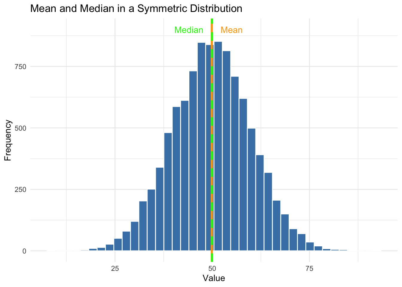
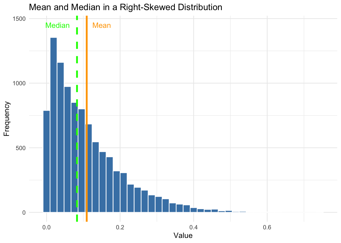
Let’s look at two examples: one symmetric, one skewed. We’ll overlay vertical lines for the mean and median so you can see how they behave in each case.
In a symmetric distribution, the mean and median are nearly identical. In this example, both are around 50. This is why the mean is often a reliable summary when data are normally distributed.
In the right-skewed case, we can see that the mean is pulled to the right by a few large values, while the median stays closer to the bulk of the data. This is why the median can sometimes offer a more realistic picture of central tendency, especially when distributions are skewed.
The lesson here is to always look at how your data are distributed before analyzing them. When reading or in a presentation, you should ask yourself whether the mean make sense given the distribution of the measure. Could extreme values in a skewed distribution make the mean not as useful? Have the analysts shown you the distribution? If not, ask about it!
Your Turn!!
Calculate the mean and median for the women_empowerment variable in the vdem2022 data frame.
Now overlay the mean and median on a density plot of women_empowerment using geom_vline().
What do you notice about the relationship between the mean and median in this case?
Try the same visualization with the polarization variable. Are the mean and median for polarization close together or far apart? How does this distance compare to the women_empowerment variable?
Measures of Dispersion
We have seen how an important thing that we want to know about our data is how much variability there is, e.g. how tightly or loosely the values are clustered around the center. This variability is often referred to as the spread of the distribution.
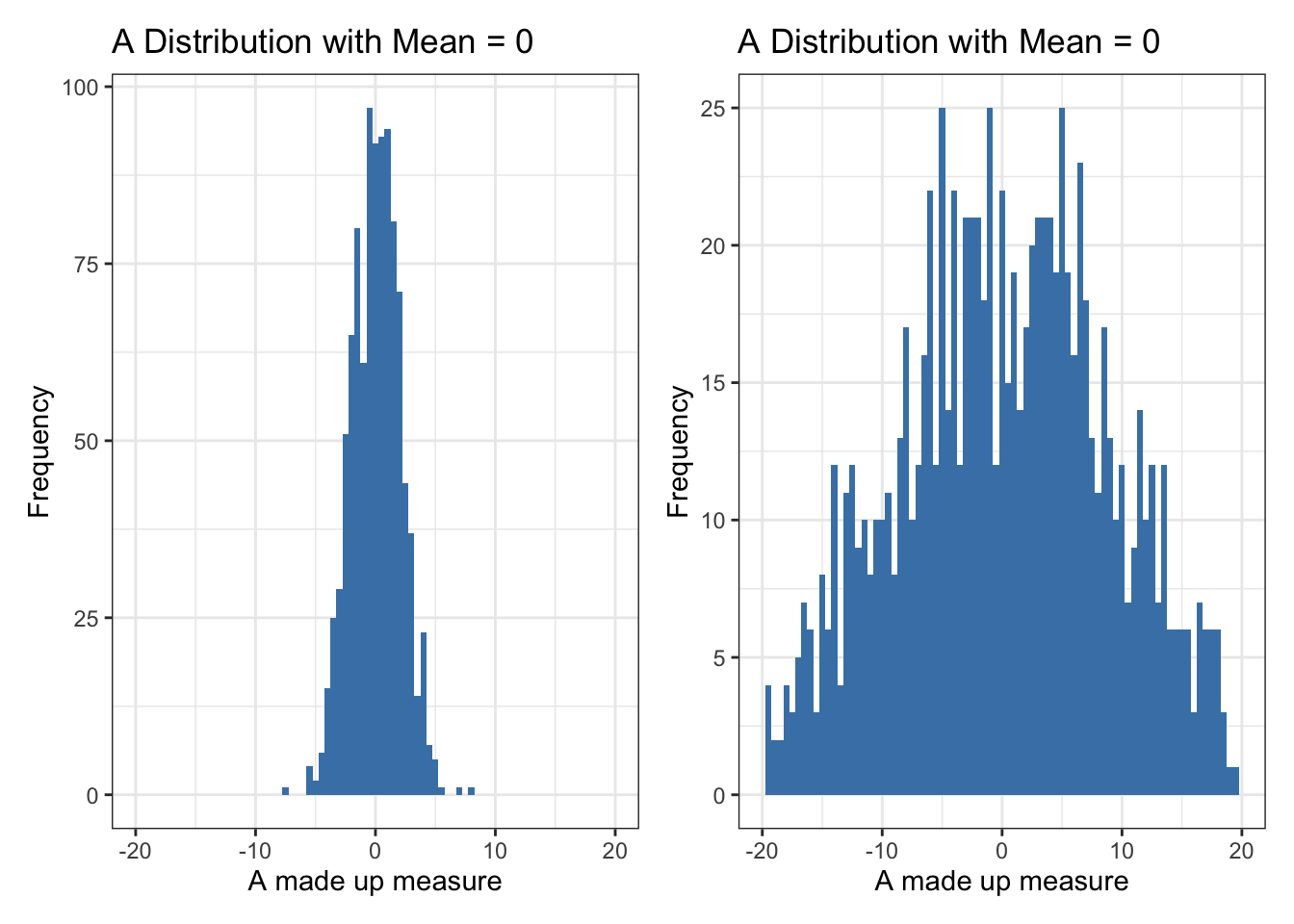
Why should we be concerned with spread? Let’s start by comparing two distributions. Both have the same mean — zero — but one has values tightly clustered around that mean, while the other spreads out much more broadly.
Even without doing any math, we can see that the second distribution is more dispersed. But to describe and compare distributions in a consistent way, we need to summarize that spread with numbers.
Range: A Starting Point
One of the simplest ways to measure spread is the range, which is just the difference between the minimum and maximum values.
vdem2022|>summarize(min =min(polarization, na.rm =TRUE), max =max(polarization, na.rm =TRUE))
     min   max
1 -3.115 3.538
While easy to calculate, the range only tells us about the extremes. It doesn’t tell us where most values lie, and it’s highly sensitive to outliers. We need something more robust.
The Interquartile Range (IQR)
A more useful measure of spread is the interquartile range (IQR) — the range of the middle 50% of the data. It spans from the 25th percentile (Q1) to the 75th percentile (Q3).
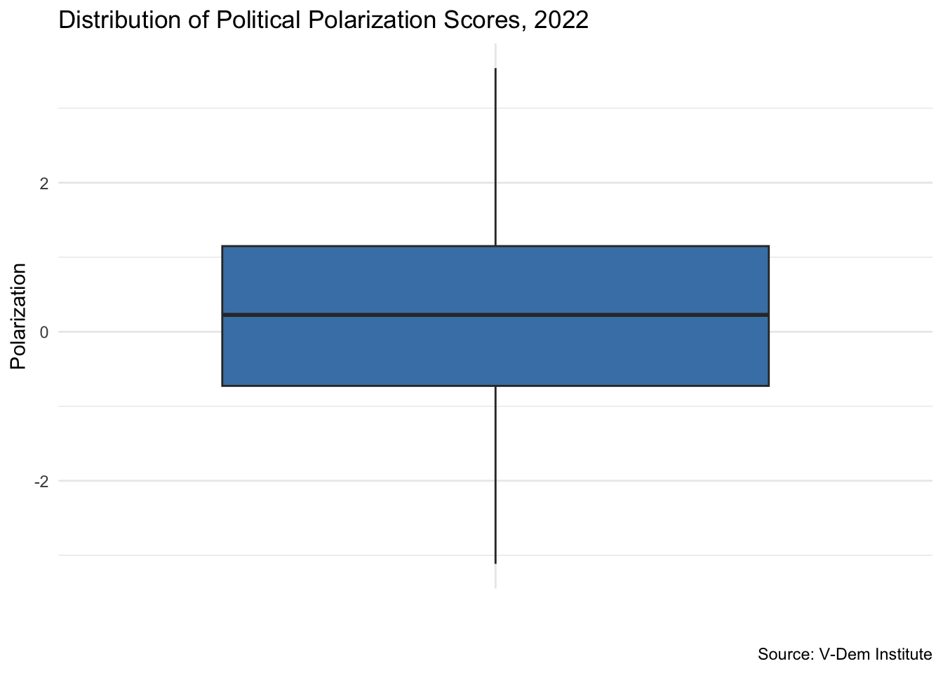
This gives us a much better sense of where the “typical” values are. In this example, most countries had political polarization scores between -0.73 and 1.15 in 2022.
The box plot is a powerful tool for visually summarizing the spread of a distribution. It provides a standardized way to display key features of a dataset using what’s known as the five-number summary: the minimum, first quartile (Q1), median, third quartile (Q3), and maximum. In R we can make a boxplot with the geom_boxplot() function from the ggplot2 package.
ggplot(vdem2022, aes(x ="", y =polarization))+geom_boxplot(fill ="steelblue")+labs( x ="", y ="Polarization", title ="Distribution of Political Polarization Scores, 2022", caption ="Source: V-Dem Institute")+theme_minimal()
At its core, a box plot helps us quickly see where most values lie and how they are distributed across the range. The “box” itself shows the interquartile range — the middle 50% of the data — while the line inside the box marks the median. The “whiskers” extend to the smallest and largest values that fall within 1.5 times the interquartile range, and any values beyond that are plotted individually as potential outliers.
This makes box plots especially useful for comparing distributions across different groups. They allow us to see not just differences in center (like the median), but also differences in spread, skewness, and the presence of outliers.
Standard Deviation: The Classic Measure of Spread
The standard deviation is a widely used summary of spread. It tells us, on average, how far each observation lies from the mean. A small standard deviation means values are tightly clustered; a large one means they are more spread out. Here is an example of how to calculate the mean and standard deviation for the polarization variable in the vdem2022 data frame:
Standard deviation is derived from the variance, which is the average of the squared deviations from the mean. The standard deviation is simply the square root of the variance — bringing the result back to the original scale of the data.
Under the hood, R is calculating the standard deviation with the following formula:
To better understand how standard deviation works, let’s walk through a toy example by breaking down the formula. We’ll follow the standard formula for sample standard deviation:
Subtract the mean from each value (to get deviations),
Square those deviations,
Sum them,
Divide by \(n - 1\),
And take the square root.
Let’s try this using a simple vector of evenly spaced numbers from 0 to 10.
Important
Play the interactive code chunks below to see how each step works. You can also change the numbers in the initial vector to see how the standard deviation changes with different data.
First, we create the vector. Next, we calculate the mean (\(\bar{X}\)) of the dataset and subtract it from each data point (\(X_i\)) to calculate its deviation from the mean: \(e_i = X_i - \bar{X}\). We store that vector of deviations in a new variable called e:
Now we square each deviation: \(e_i^2 = (X_i - \bar{X})^2\). This removes negative signs and prepares the values for averaging:
Next, we sum up all of the squared deviations: \(\sum_{i=1}^{n} (X_i - \bar{X})^2\). This represents the total squared deviation from the mean or the sum of squares.
Divide the total squared deviation by \((n-1)\) get the sample variance: \(\text{Variance} = \frac{1}{n-1} \sum_{i=1}^{n} (X_i - \bar{X})^2\). Using \((n-1)\) ensures an unbiased estimate of the population variance when calculating from a sample.
Finally, we take the square root of the variance to get the standard deviation: \(s = \sqrt{\frac{1}{n-1} \sum_{i=1}^{n} (X_i - \bar{X})^2}\). Taking the square root converts the variance back to the units of the original data.
Now let’s compare our manual calculation with R’s built-in sd() function:
Your Turn
Calculate the range and interquartile range (IQR) for the women_empowerment variable in the vdem2022 data frame.
Create a box plot for women_empowerment and overlay the mean and median.
Calculate the mean and standard deviation for women_empowerment and polarization in the vdem2022 data frame using R’s built-in sd() function.
Compare your results with what we found for the polarization variable earlier in this module. What do you notice about the spread of women_empowerment compared to polarization?