Install the performance package: install.packages("performance") and read the documentation
Install the GGally package: install.packages("GGally") and read the documentation
Run the following code to get set up for this module:
Code
library(tidyverse)library(vdemlite)# Load V-Dem data for 2019model_data<-fetchdem( indicators =c("v2x_libdem", "e_gdppc", "v2cacamps","v2x_gender","v2x_corr","e_regionpol_6C"), start_year =2006, end_year =2006)|>rename( country =country_name, lib_dem =v2x_libdem, wealth =e_gdppc, polarization =v2cacamps, women_empowerment =v2x_gender, corruption =v2x_corr, region =e_regionpol_6C)|>mutate( region =factor(region, labels =c("Eastern Europe", "Latin America", "MENA", "SS Africa", "The West", "Asia & Pacific")))#glimpse(model_data)
Overview
You’ve learned to fit linear regression models, interpret coefficients, handle outliers, and select variables. But how do you know if your model is actually valid? Linear regression makes several important assumptions, and violating these can lead to misleading results, incorrect inferences, and poor predictions.
The key insight is that we should examine our data before fitting models and then validate our assumptions after fitting them. This two-stage approach—exploratory data analysis (EDA) followed by residual diagnostics—helps ensure our models are both appropriate and reliable. Think of EDA as reconnaissance before battle and residual diagnostics as quality control after production.
In this module, we’ll explore comprehensive EDA techniques using the performance and GGally packages, then learn to check the four key assumptions underlying linear regression. These assumptions are often remembered by the acronym LINE, which we’ll explore in detail. We’ll continue using the democracy and development data from previous modules to illustrate these diagnostic techniques and remedial strategies.
By the end of this module, you’ll understand how to conduct thorough exploratory data analysis to spot potential modeling issues before they become problems. You’ll master the four key assumptions of linear regression and know how to check them systematically. Most importantly, you’ll develop the judgment to know when assumption violations are serious enough to require action and when they can be acknowledged but not necessarily fixed.
Exploratory Data Analysis (EDA)
Before fitting any regression model, we should thoroughly explore our data. This exploratory phase can reveal potential problems and guide our modeling strategy. The GGally package provides powerful tools for comprehensive exploratory data analysis (EDA) that integrate seamlessly with our tidyverse workflow, allowing us to examine multiple relationships simultaneously rather than creating dozens of individual plots.
The ggpairs() function creates a matrix of plots showing relationships between all pairs of variables. This gives us a comprehensive overview in a single visualization, something that would otherwise require creating many individual plots. The beauty of this approach is that it reveals patterns we might miss when examining variables one at a time.
ggpairs() fits right into our Tidyverse workflow. Here we are selecting the continuous variables we want to examine from our model_data (dataset, which includes )lib_dem, wealth, polarization, corruption, and region) with the : operator and then piping those variables into ggpairs().
This single command creates a rich matrix of information. The diagonal shows the distribution of each variable, helping us assess whether variables are normally distributed, skewed, or have unusual patterns. The upper triangle displays correlation coefficients, giving us a quick sense of which variables are most strongly related. The lower triangle presents scatterplots showing the actual relationships between variables, where we can spot non-linear patterns, outliers, or changes in variance.
When examining the ggpairs() output, we’re looking for several key patterns. Linearity is crucial since linear regression assumes straight-line relationships, so we watch for curves or bends in the scatterplots. Outliers appear as points far from the main pattern and can dramatically influence our regression results. Skewness in the diagonal plots might suggest the need for transformations. Heteroscedasticity refers to changing variance across the range of predictors, which often manifests as a funnel shape in scatterplots. Finally, strong correlations between predictors might signal multicollinearity problems we’ll need to address.
The correlation coefficients in the upper triangle deserve special attention. Values close to +1 or -1 indicate strong linear relationships, while values near 0 suggest weak relationships. As a rule of thumb, we are on the lookout for correlations that are stronger than 0.7 or weaker than -0.7, as these suggest potentially important relationships that we should explore further. Note, however, correlation coefficients can be misleading if relationships are non-linear, which is why we also examine the scatterplots below the diagonal.
Patterns Across Groups
Remember ridge plots from earlier modules? They’re perfect for comparing distributions across groups, and they provide a elegant way to examine how our outcome variable varies across different categories. Let’s examine how women’s empowerment varies by region using this technique we learned in an earlier module.
This plot reveals important patterns that will inform our modeling strategy. One thing that really jumps out is that the distributions are much more normally distributed at the regional level relative to the overall distribution that we saw in our earlier pairs plot (which was heavily left-skewed). But we also see very different distributions across regions. For example, Western Europe and North America show high women’s empowerment scores just above 0.9, creating a tight distribution that suggests consistency within this region. Whereas Asia shows lower scores concentrated around 0.6, indicating systematically different political systems and Sub-Saharan Africa displays a wide spread of scores, suggesting substantial variation within the region.
These regional patterns suggest that inculding region as a control variable in our models will be important. It also suggests that we might want to explore interactions between region and other predictors, such as wealth, to see if the relationships differ across regions.
Your Turn!
Looking at the ggpairs() output, are there variables that show heavy skewness?
Are there any variables that appear to have non-linear relationships with lib_dem?
Do you notice any strong correlations between predictors that might suggest multicollinearity?
Are there any outliers that stand out in the scatterplots?
Try creating a ridge plot for some of the variables in the dataset, particularly ones with skewness and outliers. Do these patterns persist at the regional level? How does this influence your modeling decisions?
The LINE Conditions: What Linear Regression Assumes
Now that we’ve explored our data, let’s formalize the assumptions underlying linear regression. These assumptions aren’t arbitrary mathematical requirements but reflect important properties that make linear regression a sensible approach to modeling relationships. The assumptions are often remembered by the acronym LINE: Linearity, Independence, Normality, and Equal variance.
Linearity assumes that the relationship between predictors and outcome is linear. This doesn’t mean the relationship has to be perfectly straight, but the general pattern should follow a linear trend. If the true relationship is curved, a straight line will systematically over-predict in some regions and under-predict in others, leading to biased results.
Independence requires that observations are independent of each other. This assumption is often violated in ways that aren’t immediately obvious, such as when data points are clustered in time, space, or social groups. When observations are correlated, our standard errors become unreliable, leading to overconfident statistical inferences.
Normality refers to the distribution of residuals, not the original variables. The residuals should be approximately normally distributed around zero. This assumption is particularly important for hypothesis testing and confidence intervals, though it becomes less critical with larger sample sizes due to the Central Limit Theorem.
Equal variance, also called homoscedasticity, requires that residuals have constant variance across all values of the predictors. When this assumption is violated (called heteroscedasticity), our model’s predictions become more reliable for some values than others, and our standard errors become incorrect.
Understanding why these assumptions matter helps us make better modeling decisions. Each assumption serves a specific purpose in ensuring that our regression results are trustworthy and interpretable. Linearity ensures that our linear model accurately captures the relationship. Independence is crucial for valid statistical inference because correlated observations invalidate our standard error calculations. Normality of residuals is needed for valid hypothesis tests and confidence intervals, particularly in smaller samples. Equal variance ensures that our model’s predictions are equally reliable across all values of the predictors.
Residual Diagnostics
While our earlier exploratory data analysis provided early warnings about potential assumption violations, EDA alone is not sufficient for checking assumptions. The patterns we see in raw data guide our transformation decisions, but we need to examine residuals from our fitted model (using the transformed variables) to formally check whether our assumptions are met. Residuals represent what’s left unexplained after our model has done its best to capture the relationships in the data.
Let’s fit our model and then examine the residuals to systematically check our assumptions. We’ll use the democracy model we have been developing throughout this module series, which includes log-transformed wealth (based on what we learned from our EDA), polarization, corruption, and regional controls.
# Fit our democracy modeldemocracy_model<-lm(lib_dem~log(wealth)+polarization+corruption+women_empowerment+region, data =model_data)# Quick model summarysummary(democracy_model)
Call:
lm(formula = lib_dem ~ log(wealth) + polarization + corruption +
    women_empowerment + region, data = model_data)

Residuals:
     Min       1Q   Median       3Q      Max
-0.43252 -0.06331  0.00253  0.07402  0.26311

Coefficients:
                      Estimate Std. Error t value Pr(>|t|)
(Intercept)           0.125962   0.093258   1.351   0.1787
log(wealth)          -0.001450   0.014026  -0.103   0.9178
polarization         -0.009154   0.008323  -1.100   0.2730
corruption           -0.344607   0.055068  -6.258 3.35e-09 ***
women_empowerment     0.640860   0.072556   8.833 1.61e-15 ***
regionLatin America   0.062175   0.033837   1.837   0.0680 .
regionMENA           -0.004997   0.043303  -0.115   0.9083
regionSS Africa      -0.011206   0.034987  -0.320   0.7491
regionThe West        0.109096   0.039341   2.773   0.0062 **
regionAsia & Pacific -0.029083   0.036100  -0.806   0.4216
---
Signif. codes:  0 '***' 0.001 '**' 0.01 '*' 0.05 '.' 0.1 ' ' 1

Residual standard error: 0.1228 on 162 degrees of freedom
  (5 observations deleted due to missingness)
Multiple R-squared:  0.8055,    Adjusted R-squared:  0.7947
F-statistic: 74.55 on 9 and 162 DF,  p-value: < 2.2e-16
Now we’ll systematically check each assumption using residual plots. Residuals are the differences between our observed values and the values predicted by our model. If our model is appropriate and our assumptions are met, these residuals should exhibit random patterns with no systematic structure.
Checking Linearity: Residuals vs. Fitted
The residuals versus fitted values plot is perhaps the most important diagnostic plot because it can reveal multiple types of problems simultaneously. If our linearity assumption is met, residuals should be randomly scattered around zero with no systematic patterns.
Code
library(plotly)# Extract model informationmodel_data_diag<-model_data|>drop_na()|>mutate( fitted =fitted(democracy_model), residuals =residuals(democracy_model))# Residuals vs. fitted plotr_vs_fitted<-model_data_diag|>ggplot(aes(x =fitted, y =residuals))+geom_point(aes(text =country), alpha =0.6)+geom_hline(yintercept =0, color ="red", linetype ="dashed")+geom_smooth(se =FALSE, color ="blue")+labs(x ="Fitted Values", y ="Residuals", title ="Residuals vs. Fitted Values")+theme_minimal()ggplotly(r_vs_fitted)|>config(displayModeBar =FALSE)
Here we are looking at the residuals (the differences between observed and predicted values) plotted against the fitted values (the predicted values from our model). The red dashed line represents zero, and the blue line is a smoothing line that helps us see the overall trend in the residuals. Points above the red line indicate that our model under-predicted those observations (meaning the model predicted that the country was less democracy than it actually was), while points below the line indicate over-predictions (meaning that the model predicted that the country was more democratic than in reality).
Ideally we would want to see points that are randomly scattered around the horizontal line at y = 0. The blue smoothing line should be roughly horizontal and close to zero. If we see systematic patterns such as U-shapes, inverted U-shapes, or consistent trends, this suggests that our linear model is missing important non-linear relationships.
In this case, we definitely see some curvature to the line. The model is under-predicting countries with low democracy scores, over-predicting countries with mid-level democracy scores and under-predicting again at higher levels of democracy. This suggests that the relationship between our predictors and the outcome is not purely linear, and we might need to consider non-linear transformations or additional predictors to capture this pattern.
Note
The model predicts values of democracy below what an actual country could achieve, which is not possible. This may be due to nonlinearity in the relationship between our predictors and the dependent variable as we already discussed. But it could also be due to the fact that our dependent variable, lib_dem, is bounded between 0 and 1. We could therefore consider other models that are designed for bounded outcomes, such as beta regression or tobit models. However, for the purposes of this module, we will continue with linear regression and focus on checking our assumptions.
Checking Normality: Q-Q Plot
The Q-Q (quantile-quantile) plot compares the distribution of our residuals to what we would expect from a normal distribution. This plot is particularly useful because it makes deviations from normality easy to spot.
Code
# Calculate Q-Q values manually to preserve country namesqq_data<-model_data_diag|>arrange(residuals)|>mutate( theoretical =qnorm(ppoints(length(residuals))), ordered_residuals =sort(residuals), country_ordered =country[order(residuals)])qq_plot<-qq_data|>ggplot(aes(x =theoretical, y =ordered_residuals, text =country_ordered))+geom_point()+geom_abline(slope =sd(model_data_diag$residuals), intercept =mean(model_data_diag$residuals), color ="red")+labs(title ="Normal Q-Q Plot of Residuals", x ="Theoretical Quantiles", y ="Sample Quantiles")+theme_minimal()qq_plot
Points should fall roughly along the red diagonal line if residuals are normally distributed. Systematic deviations from this line suggest non-normal residuals. Points that curve away from the line at the ends indicate heavy tails, while S-shaped curves suggest skewness. Small deviations aren’t usually concerning, especially with larger sample sizes, but dramatic departures from the line warrant attention.
Looking at this Q-Q plot, we can see a pattern that is fairly reassuring about our model’s performance. The points follow the red diagonal line quite well through the middle range (roughly between -1.5 and +1.5 theoretical quantiles), indicating that the central portion of our residuals is approximately normally distributed. However, at both ends of the distribution, the points fall slightly below the line, suggesting that our residuals have “light tails” compared to a perfect normal distribution. This means our model produces fewer extreme prediction errors—both very large over-predictions and very large under-predictions—than we would expect from a normal distribution.
Checking Equal Variance: Scale-Location Plot
The scale-location plot helps us assess whether the variance of residuals remains constant across all fitted values. This plot uses the square root of the absolute value of residuals, which makes patterns easier to see.
Code
# Scale-location plotscale_location_plot<-model_data_diag|>mutate(sqrt_abs_resid =sqrt(abs(residuals)))|>ggplot(aes(x =fitted, y =sqrt_abs_resid))+geom_point(aes(text =country), alpha =0.6)+geom_smooth(se =FALSE, color ="blue")+labs(x ="Fitted Values", y ="√|Residuals|", title ="Scale-Location Plot")+theme_minimal()ggplotly(scale_location_plot)|>config(displayModeBar =FALSE)
Here we are looking for a roughly horizontal blue line and equal spread of points across all fitted values. If the blue line shows an increasing or decreasing trend, this suggests heteroscedasticity. Heteroscedasticity means that the variance of residuals changes with fitted values, which violates the equal variance assumption. The most common pattern is increasing variance with larger fitted values, which appears as an upward-sloping trend in this plot.
With our data we are seeing a line that slopes downward, then upward and then downward again. This pattern suggests that our model performs most consistently when predicting highly democratic countries (mainly established Western democracies with stable institutions), while showing much more variability when predicting countries with low to moderate democracy scores (possibly reflecting the inherent volatility and unpredictability of transitional political systems or authoritarian regimes).
Substantively, this heteroscedasticity pattern makes theoretical sense—established democracies are more predictable based on economic and social indicators, while countries undergoing political transitions or operating under authoritarian systems may be subject to sudden changes that our model cannot capture. From a statistical perspective, however, this represents a clear violation of the equal variance assumption, indicating that our standard errors may be incorrect and that we should use robust standard errors when making statistical inferences.
Automated Diagnostics
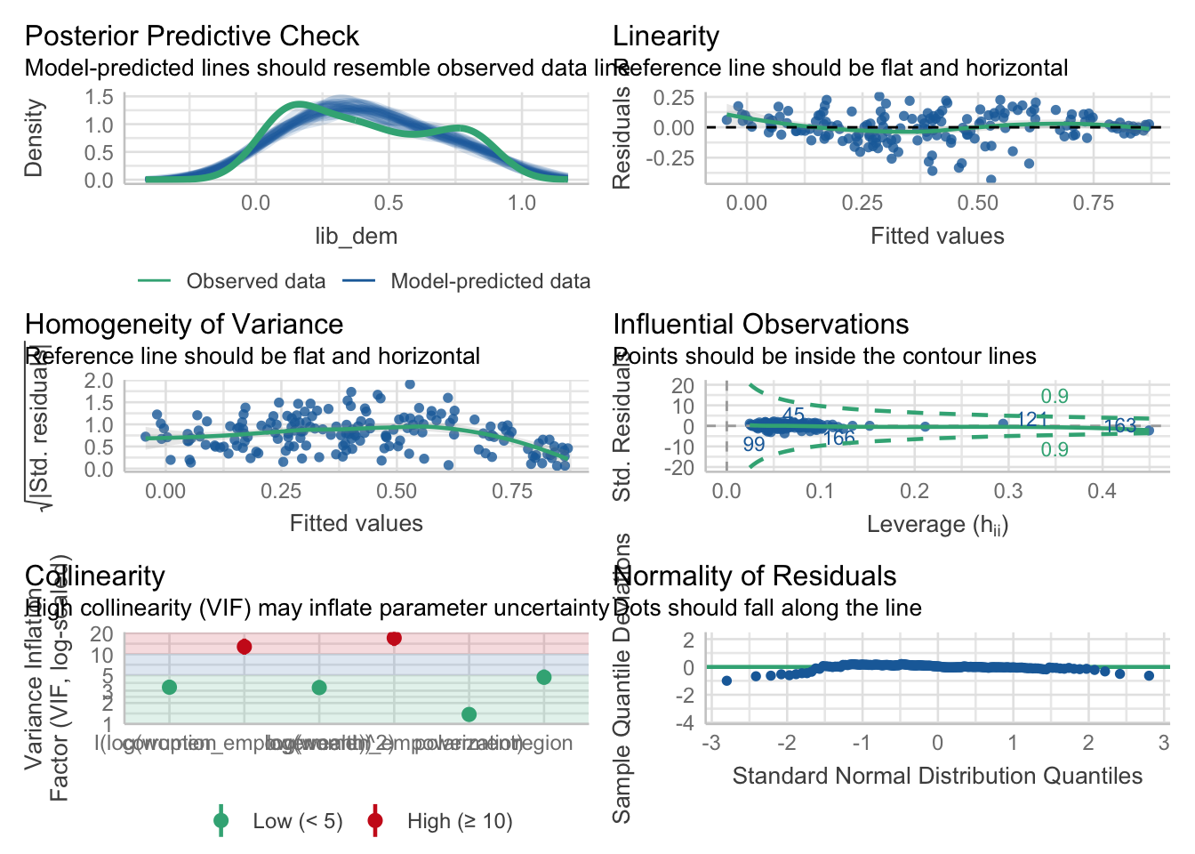
Now that we know what the basic residual plots are and how to interpret them, we can lighten our load a little bit by using a package that automates the diagnostic process. The performance package provides a convenient check_model() function that generates a comprehensive set of diagnostic plots and statistics for our fitted model. This function produces the same types of plots we created manually and also includes additional diagnostics like multicollinearity checks (VIF values) and checks for influential observations.
Let’s try running check_model() on our democracy model to see what it tells us about our assumptions:
Here we we see the same issues highlighted in terms of linearity, normality, and equal variance that we identified manually. The residuals versus fitted plot shows a clear non-linear pattern, the Q-Q plot indicates slight deviations from normality, and the scale-location plot suggests heteroscedasticity. The VIF values indicate that multicollinearity is not a concern in this model, as all values are below the common threshold of 5 and there are no influential observations.
Variable-level Diagnostics with GGally
Now that we know we have these issues, we can use the GGally package to create variable-level diagnostic plots that help us understand how each predictor contributes to these patterns. The ggnostic() function provides a comprehensive set of diagnostic plots for each predictor in our model, allowing us to see how they relate to the residuals and fitted values.
The ggnostic() output helps us identify the specific source of the issues that the check_model() diagnostics revealed concerning patterns of non-linearity and heteroscedasticity in our overall model. Examining the first two rows of the ggnostic() plots, we can see that the women empowerment variable stands out with a distinctly wiggly blue line in the residuals plot and changing variance patterns in the scale-location plot, while other predictors show relatively flat, well-behaved relationships. This suggests that women empowerment is contributing to the assumption violations we observed in the overall model diagnostics.
Fixing the Problems: Transformation Strategies
When we detect assumption violations, we have several remedial strategies available. Variable transformations are often the first line of defense because they can simultaneously address multiple issues.
Log transformations are particularly useful for skewed relationships and can address both non-linearity and heteroscedasticity simultaneously. We’ve already seen how log transformations help with wealth data, which tends to be highly skewed with a few very wealthy countries. Another option for addressing nonlinearity is to add polynomial terms, which allow us to capture curved relationships without transforming the original variable.
Note
There are many other strategies for addressing assumption violations, such as adding interaction terms, using robust standard errors, or employing generalized linear models. However, variable transformations are often the most straightforward and effective first step and also the most suitable for an introductory module like this one. As you gain more experience, you can learn about more strategies and how to apply them.
To address the model assumptions we identified in our democracy model, we can implement both a logarithmic transformation and a polynomial term for women empowerment log(women_empowerment) + I(log(women_empowerment)^2), allowing the model to capture the curved relationship and potentially reducing both the systematic residual patterns and heteroscedasticity that were evident in our original specification.
# Fit our democracy modeldemocracy_model2<-lm(lib_dem~log(wealth)+polarization+corruption+log(women_empowerment)+I(log(women_empowerment)^2)+region, data =model_data)# Quick model summarysummary(democracy_model2)
Call:
lm(formula = lib_dem ~ log(wealth) + polarization + corruption +
    log(women_empowerment) + I(log(women_empowerment)^2) + region,
    data = model_data)

Residuals:
     Min       1Q   Median       3Q      Max
-0.43129 -0.06233  0.00449  0.07454  0.25560

Coefficients:
                             Estimate Std. Error t value Pr(>|t|)
(Intercept)                  0.786701   0.059870  13.140  < 2e-16 ***
log(wealth)                 -0.006507   0.014176  -0.459  0.64682
polarization                -0.010578   0.008298  -1.275  0.20421
corruption                  -0.326338   0.055780  -5.850 2.66e-08 ***
log(women_empowerment)       0.706621   0.102286   6.908 1.08e-10 ***
I(log(women_empowerment)^2)  0.250075   0.054304   4.605 8.33e-06 ***
regionLatin America          0.063280   0.033694   1.878  0.06218 .
regionMENA                   0.002799   0.043352   0.065  0.94860
regionSS Africa             -0.012929   0.034752  -0.372  0.71035
regionThe West               0.110825   0.039155   2.830  0.00524 **
regionAsia & Pacific        -0.017515   0.036552  -0.479  0.63246
---
Signif. codes:  0 '***' 0.001 '**' 0.01 '*' 0.05 '.' 0.1 ' ' 1

Residual standard error: 0.1222 on 161 degrees of freedom
  (5 observations deleted due to missingness)
Multiple R-squared:  0.8086,    Adjusted R-squared:  0.7967
F-statistic: 68.03 on 10 and 161 DF,  p-value: < 2.2e-16
Understanding the Code
Here we use the inhibit I() function so that R treats it is a literal mathematical expression, e.g. “take the log of women_empowerment and then square it”. This allows us to include polynomial terms in our model without R interpreting them as interaction terms of special formula operators.
The results of the analysis are interesting from a substantive perspective. Both the linear term and the quadratic term are positive and statistically significant. This suggests an upward opening parabola, whereby as women’s empowerment increases, democracy increases at an accelerating rate. Now let’s run check_model() on our new democracy model and see if our transformations had the desired effect with respect to satisfying model assumptions:
Here we see a slight improvement in our plots. The residuals versus fitted plot still shows some non-linearity, but the pattern is less pronounced than before. The Q-Q plot shows that the residuals are closer to normality, and the scale-location plot indicates that the variance of residuals is more constant across fitted values.
We definitely still have a high degree of heteroscedasticity, which could be an argument in favor of using robust standard errors or considering a different modeling approach, but at least this provides you with a sense of how we can systematically address assumption violations with the help of diagnostic plots.
Your Turn!
Try running ggnostic(democracy_model2) to see how the variable-level diagnostics have changed. Are there any other predictors that could benefit from transformations?
Try tansforming the corruption variable using a log transformation and see how that affects the model diagnostics using check_model(). Does it help with the non-linearity or heteroscedasticity?
Now try adding a polynomial term for polarization, e.g. I(polarization^2), and see how that affects the model diagnostics. Does it help with the non-linearity or heteroscedasticity?
Try running ggnostic() on your new model and make any additional changes as you see fit.
Conclusion
Checking model assumptions is not just a statistical formality but an essential component of producing reliable, interpretable results. The combination of thorough exploratory data analysis and systematic residual diagnostics gives you confidence that your models are appropriate for your data and research questions.
The process we’ve outlined—starting with comprehensive EDA, fitting thoughtfully chosen models, and systematically checking assumptions—represents best practice in regression analysis. This approach helps you catch problems early, make informed decisions about model specifications, and communicate limitations honestly to your audience.
Remember that linear regression remains one of the most powerful and interpretable tools in data science, but like any tool, it works best when used appropriately. Perfect adherence to all assumptions is rare in real-world data, so developing judgment about when violations matter and when they don’t is crucial for practical data analysis.
In our next module, we’ll build on these foundations to explore more advanced modeling techniques and learn when linear regression might not be the right tool for the job. Understanding when and why linear regression works prepares you to recognize situations where alternative approaches might be more appropriate.